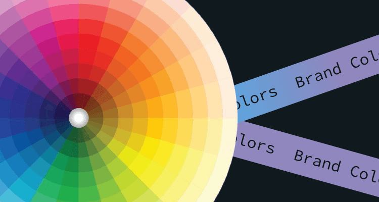
Red makes you hungry, blue calms you, and yellow gives you a “pick-me-up” mood. Color psychology—leveraging colors to produce an effect—can influence 85% of customers' purchasing decisions. For example, merchandisers use different colors to trigger emotions needed to get customers to buy. In this article we will have a look at what colors can attract more attention to your ad campaign.
How Entrepreneurs Can Use Color Psychology for Their Needs?
Color psychology plays a significant role in how consumers make decisions and evaluate brands. Let’s check some figures:
- Up to 90% of an initial impression comes from color
- Color can increase brand awareness and recognition by 80%
- 93% of consumers make purchasing decisions based on visuals alone
When choosing colors for your brand and advertising, there are several important considerations to keep in mind:
- Brand Essence and Perception
The way you want to be perceived by customers can help narrow down your color scheme. For example, suppose your brand essence is about celebrating some event. In that case, you may choose optimistic yellow alongside a color typically associated with your product, such as brown.
- Context of Display
Consider when and where the brand will be displayed to ensure it fits and stands out appropriately. This includes considering the primary environment where the brand will be displayed.
- Marketing Efforts and Mediums
Consider where most of your marketing efforts are spent and develop a palette best suited for those strategies. For example, if your company invests a lot of money in newspaper advertising, choosing a pastel palette may take a lot of work to render accurately in this medium due to the nature of the paper stock.
- Brand Experience and Culture
When picking brand colors, consider the brand experience and cultural factors. Politics, history, myths, religion, and language can impact how your audience perceives specific colors.
- Number of Colors in Brand Palette
Most companies have one or two corporate colors in their brand palette, matching the colors in the company logo. Limiting yourself to one or two dominant colors creates a memorable and impactful brand.
- Consistency and Unity
Using the same colors across all materials creates a feeling of unity, making your brand feel more trustworthy and professional.
- Brand Story and Authenticity
Your brand color palette should match your authentic brand story and work for your business. Choose colors representing your brand everywhere and stick to a single dominant color if possible.
- Industry and Audience Expectations
Consider the commonly used colors in advertising for your industry. Audiences tend to connect with their needs and expectations from brands in your industry. This choice is part aesthetic, part testing, and part science.
Colors in Details in Marketing
Here are some other essential color associations to consider for your emotional ads:
- Red: excitement, passion, anger, danger, action, anxiety, power.
- Orange: playfulness, friendliness, creativity, warmth, enthusiasm.
- Yellow: happiness, optimism, warning, joy, originality, enthusiasm.
- Green: Youth, vibrancy, vigor, nature, growth, stability.
- Blue: Calm, stability, depth, peacefulness, trust.
- Purple: Royalty, luxury, romance, introspection, calm.
Blue
Blue is the most popular color globally, with 57% of men and 35% of women choosing it as their favorite. Many top brands also love blue, the most commonly used logo color, appearing in 33%.
Blue brings a sense of security, strength, wisdom, and trust. That's why social media platforms like Facebook and Twitter use blue in their branding; it makes them seem reliable, which is essential for companies that handle user data.
However, blue can also have negative associations. It's not a standard color for food, so it can suppress our appetite and give off a cold and unfriendly vibe.
By understanding the different aspects of blue and its effects, brands can use it effectively to inspire trust and reliability while being mindful of potential negative associations.
Orange (здесь можно сделать примеры иллюстраций по цветам для наглядности)
Orange is a bright color that conveys confidence, creativity, and courage. It works well for noncorporate brands because of its fun nature. Additionally, orange creates a warm feeling associated with the sun.
However, orange also has some not-so-positive associations. It can generate feelings of frustration, deprivation, and sluggishness. Some people may perceive it as immature or ignorant. In fact, around 29% of people rate orange as their least favorite color.
When using orange in their branding, brands should consider the context and target audience. By balancing the positive attributes of confidence, creativity, and courage with the potential negative connotations, brands can effectively incorporate orange to create a unique and captivating brand identity.
Red
Red is a powerful color that evokes excitement, energy, power, fearlessness, and passion. In sales, red call-to-action buttons create a sense of urgency and empower shoppers to convert. It also stimulates appetite, making it popular in food-related businesses.
However, red can also evoke negative feelings. It represents anger, warnings, danger, defiance, aggression, and pain. Red police lights and stop signs serve as clear warnings. In branding, red can work effectively in the proper context. Still, it should be used strategically to avoid overpowering or overwhelming the audience.
Green
Green is a color that embodies the essence of life. Inspired by the lushness of grass, the grandeur of trees, and the vibrancy of bushes, green evokes a feeling of relaxation, vitality, and rejuvenation. Unsurprisingly, green is often linked to health, prosperity, hope, and a refreshing sense of renewal.
In advertising, green is employed in various ways to convey specific messages and evoke desired emotions. The health and wellness industry frequently uses green to symbolize natural and organic products, instilling in consumers a sense of trust and well-being. Food brands often utilize green to represent freshness, underscoring their commitment to providing wholesome and nourishing choices. On the other hand, financial institutions adopt green in their branding to convey stability, growth, and economic prosperity.
Yellow
Much like its vibrant counterpart, orange, yellow is a color that exudes a sense of youthfulness and happiness. It has cheerful associations of smiley faces, sunflowers, and playful rubber ducks. Brands often harness the power of yellow to tap into the emotions of optimism, creativity, extroversion, and warmth, creating a lively and inviting atmosphere.
However, you should know that yellow branding can also evoke fear, irrationality, and anxiety. This stems from its association with cautionary elements such as police tape, traffic lights, and street signs. These visual cues remind us that the color yellow can carry a sense of warning and alertness. Thus, it is essential to approach yellow in branding with caution, considering its potential impact on consumer perceptions and emotions.
Black
The color black reigns supreme in the realm of websites, emails, and logos. As a staple color, black can bestow a brand with an air of sophistication, power, and elegance. Prominent luxury companies, such as the illustrious Chanel, employ black to lend their logos a sense of sleekness and refinement. Notably, it's no surprise that approximately three of every ten high-tech companies incorporate black into their logos, aligning with their desire to exude a sense of modernity and cutting-edge innovation.
But black also carries connotations of oppression and coldness. Some individuals may even interpret black as a symbol of evil or negativity. While black can undoubtedly evoke a sense of allure, businesses must consider this color choice's potential associations and perceptions.
White
If your business seeks to convey a sense of minimalism and simplicity, opting for white could be a perfect choice. When combined with black, white creates a sleek and contemporary aesthetic, evoking a feeling of purity, innocence, and flawlessness.
However, it is worth noting that white can sometimes give off a sterile ambiance reminiscent of a hospital environment. Without vibrant colors, it may give the impression that your brand is plain, unexciting, and lacking depth. Nevertheless, the perception of white, like any color, is subjective and depends on the specific context in which it is used. Some of the world's most groundbreaking and innovative brands, such as Apple and Tesla, have successfully incorporated white into their logos, reinforcing their ability to convey a sense of modernity and sophistication.
Pink
Pink, the color that symbolizes femininity, has become immensely popular and is widely used by brands seeking a youthful, imaginative, and quirky image. T-Mobile, for instance, fully embraces its vibrant magenta hue, leveraging it to distinguish itself from its competitors.
But pink can also evoke a sense of childlike innocence or rebelliousness. Initially, the widespread use of pink may have garnered attention. Still, its impact has somewhat diminished over time as consumers have become accustomed to the color. A visit to a Victoria's Secret store, with its walls adorned in various shades of pink, may even elicit a sense of nausea after spending considerable time surrounded by the color.
Conclusion
To make color psychology work for your marketing goals, here's a simple recap of tactics you can use:
-
Learn the basics of color psychology.
-
Start by considering the emotions you want to evoke.
-
Look for inspiration from other successful brands.
-
Create a color palette that represents your brand.
-
Keep cultural context in mind when choosing colors.
-
Consider incorporating blue, as it has a calming effect.
-
Maintain consistency in your branding.
-
Test different colors with your audience to see what resonates.
Remember, color psychology is a powerful tool for connecting with your audience and achieving your marketing objectives.


